
Reducing friction to encourage saving items to a planned trip
Users were already telling us what they wanted to do. They were tapping the heart icon to save trip items, signaling clear intent to engage with the feature. But most of them never completed the action. Instead, they dropped out of the flow entirely. This work focused on understanding what was happening in that moment between intent and completion, and how we could redesign the experience to help users follow through.
Project Snapshot
ROLE
User Experience Designer; owned the entire saving flow on the Trips team
TIMELINE
Q3 (design + alignment), Q4 (delivery & testing)
COLLABORATORS & STAKEHOLDERS
Product Manager, Engineers, Content Designer, UX Researcher
THE PROBLEM
A newly introduced “Save” (heart) feature had a ~92% drop-off rate. Users were tapping the heart icon but not completing the save flow, particularly when prompted to sign in.
THE SOLUTION
A series of coordinated experience improvements focused on reducing friction across the save flow. This included redesigning the sign-in prompt for anonymous users, introducing trip item recall for authenticated users, and optimizing trip creation steps.
THE RESULTS
Following testing and rollout in Q4, we saw:
a reduction in drop-off during the save flow
an increase in users progressing further down the shopping funnel
more trips created per user
more trip items saveds
FRAMING THE PROBLEM
It started with a simple question: why were users tapping the heart, but not finishing the save?
This work started as a collaboration between myself and the Product Manager to better understand a 92% drop-off rate in the Save experience
USERS WERE DROPPING OUT AT A HIGH RATE
The 92% drop-off rate was a clear signal that something in the experience was breaking down. Users were actively tapping the heart icon to save an item, but the majority were not completing the save flow.
THE SAVING EXPERIENCE NEEDED WORK
This behavior was consistent across both anonymous and authenticated users, indicating that the issue wasn’t limited to a single user type. Instead, it pointed to a broader problem within the experience itself.
QUESTIONS WE CONSIDERED
How might we reduce friction in the Save experience to convert high-intent interactions into completed saves?
How might we make it easier for users to successfully complete the save action in the moment they express intent?
RESEARCH & ANALYSIS
The data pointed to friction, but the full story needed context
ANALYZING THE DROP-OFF DATA
The data confirmed that the largest point of friction occurred when users attempted to save an item and were prompted to sign in or create an account. This step introduced a break in the flow that most users did not continue past.
ANALYZING COMPETITORS
We explored how similar platforms approached saving and list-building behaviors. Across travel platforms and list-based products, we saw a consistent pattern: saving was treated as a lightweight, low-friction action. These experiences often preserved context, minimized disruption, and aligned with familiar user expectations. This highlighted a gap in our experience.
LEVERAGING USER RESEARCH
We also incorporated insights from our UX research team, which clarified key behaviors within the Save experience. Users didn’t always understand the value of saving, many interactions were exploratory rather than intentional, and early interruptions introduced hesitation. These findings helped us move beyond assumptions and ground our decisions in real user behavior.
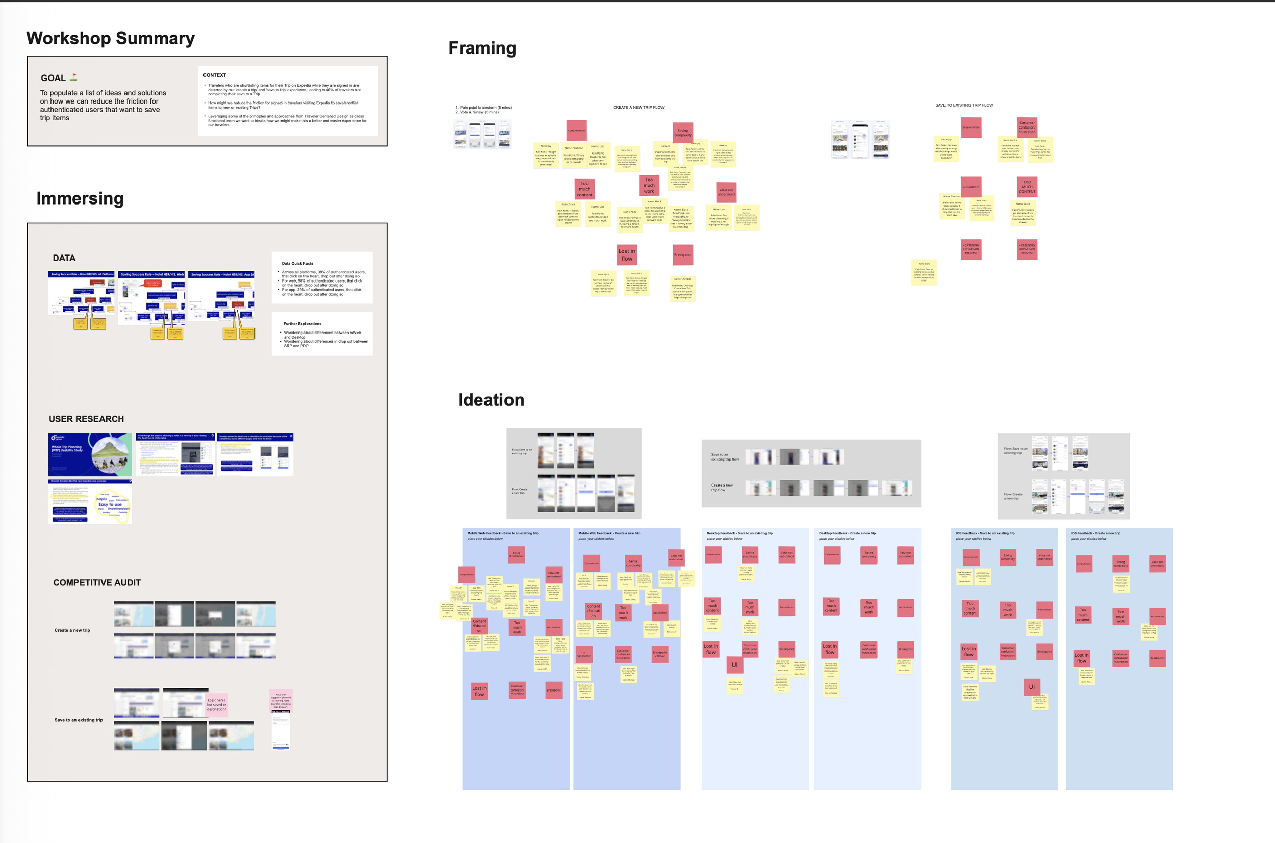
CROSS-COLLABORATIVE WORKSHOP
Before designing solutions, we aligned on the problem together
To deepen our understanding and align as a team, I co-facilitated a cross-functional workshop with the Product Manager, bringing together Designers, Engineers, and Stakeholders. We audited the current Save experience across desktop, mobile web, and app, identifying key friction points and platform-specific nuances.
The session focused on reviewing the flow and data, surfacing pain points, and exploring opportunities to reduce friction. By the end, we had a shared understanding of the problem, alignment across teams, and a clear direction for moving forward.
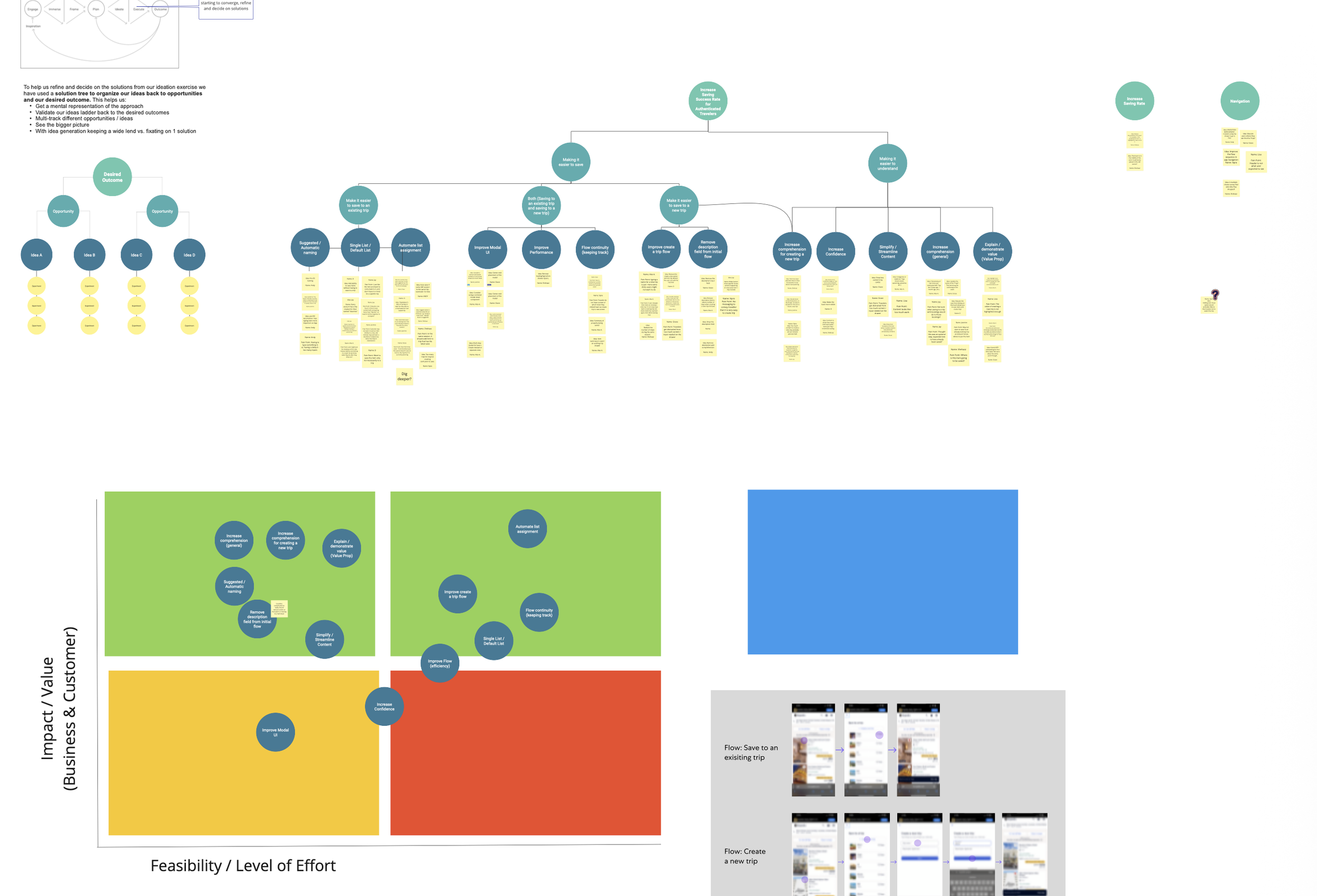
THE PATH FORWARD
Turning insights into a system of thoughtful, high-impact solutions
The workshop surfaced multiple opportunities to reduce friction across the Save experience. Rather than approaching these as isolated fixes, I partnered with the Product Manager to define a coordinated set of optimizations addressing both anonymous drop-off and friction within the authenticated flow.
I led this effort by:
synthesizing insights into clear, actionable opportunities
prioritizing solutions based on user impact and feasibility
identifying key moments to simplify the flow and reduce cognitive load
collaborating closely with engineering to deliver both large and lightweight improvements
This resulted in a system of targeted optimizations that worked together to reduce friction and improve completion of the Save action.
DESIGNING SOLUTIONS
Focusing on a critical drop off point: Sign-In for anonymous users
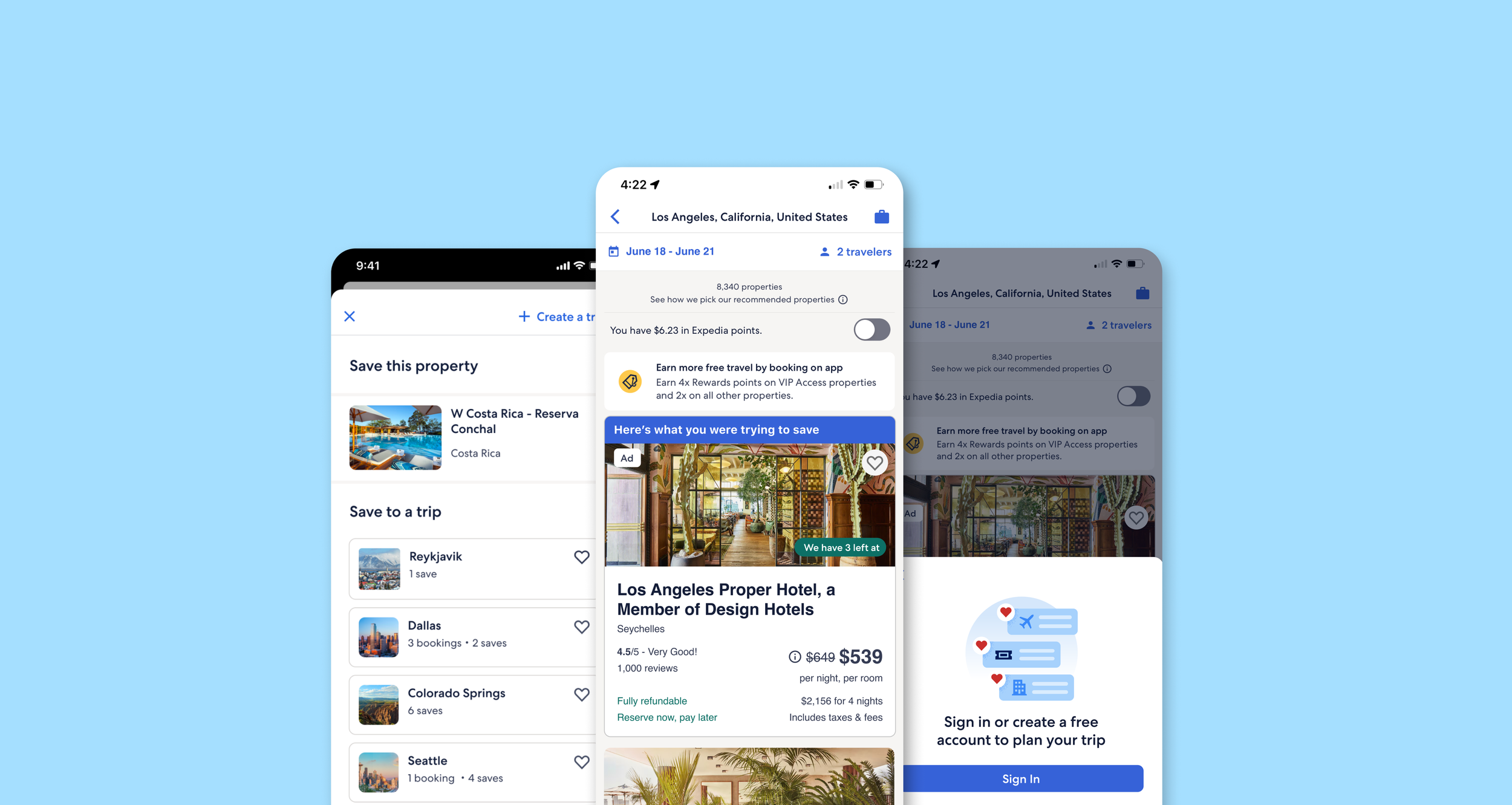
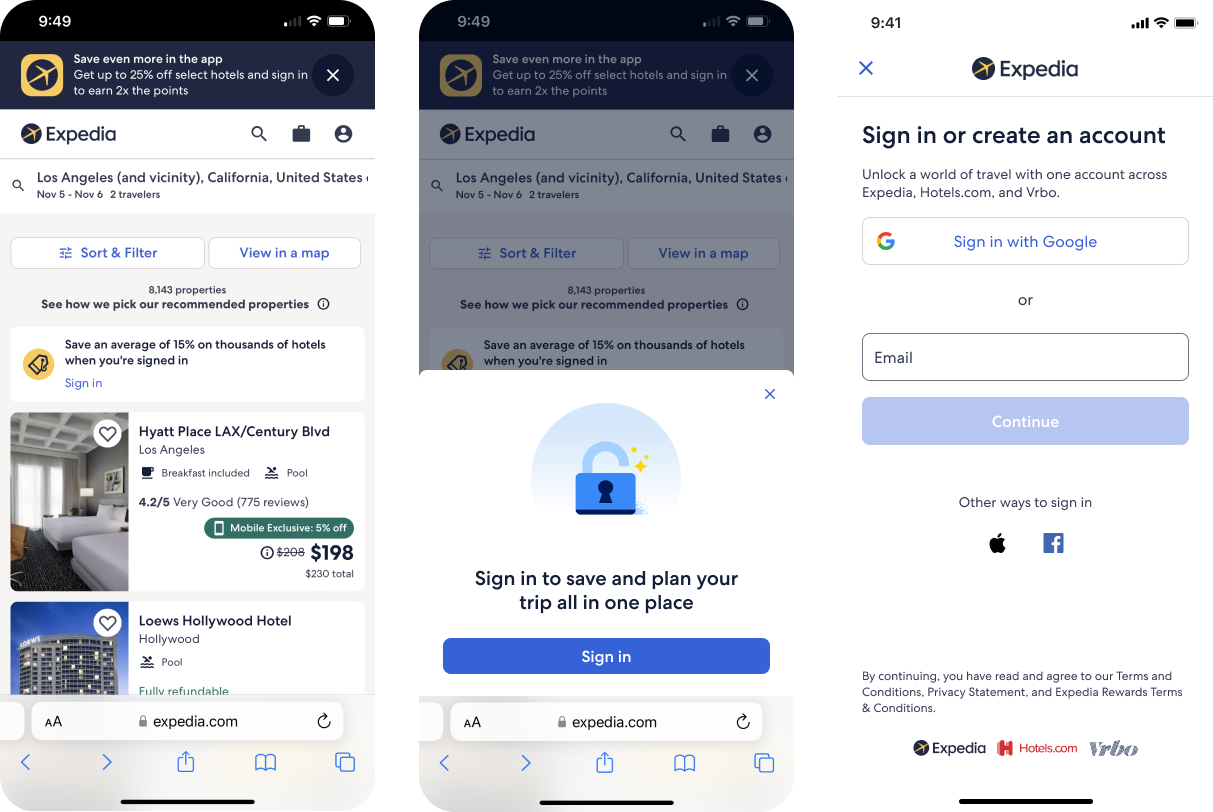
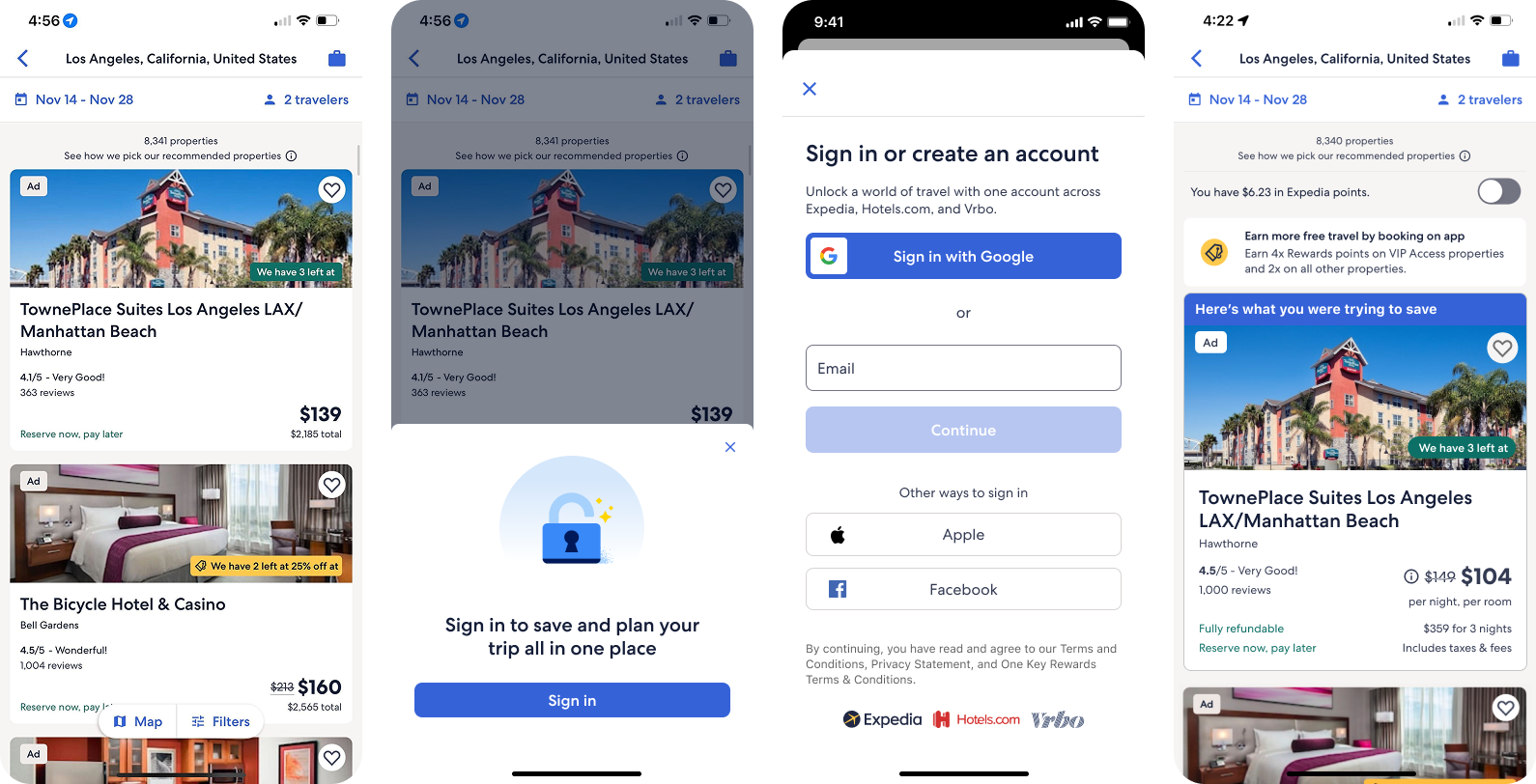
PROBLEM
Sign-in was one of the largest points of drop-off. Users were being asked to log in before completing a simple action, without enough context to understand why it mattered.
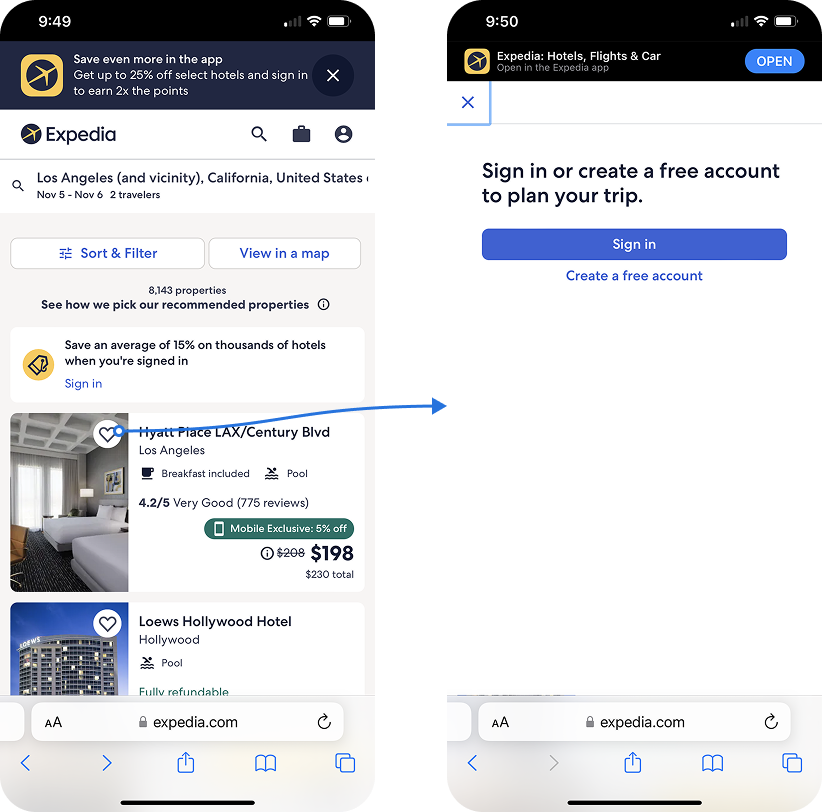
EXPLORATION
I explored multiple directions to balance clarity with disruption. This included half-screen modal variations, and different approaches to messaging, CTAs, and visual support.
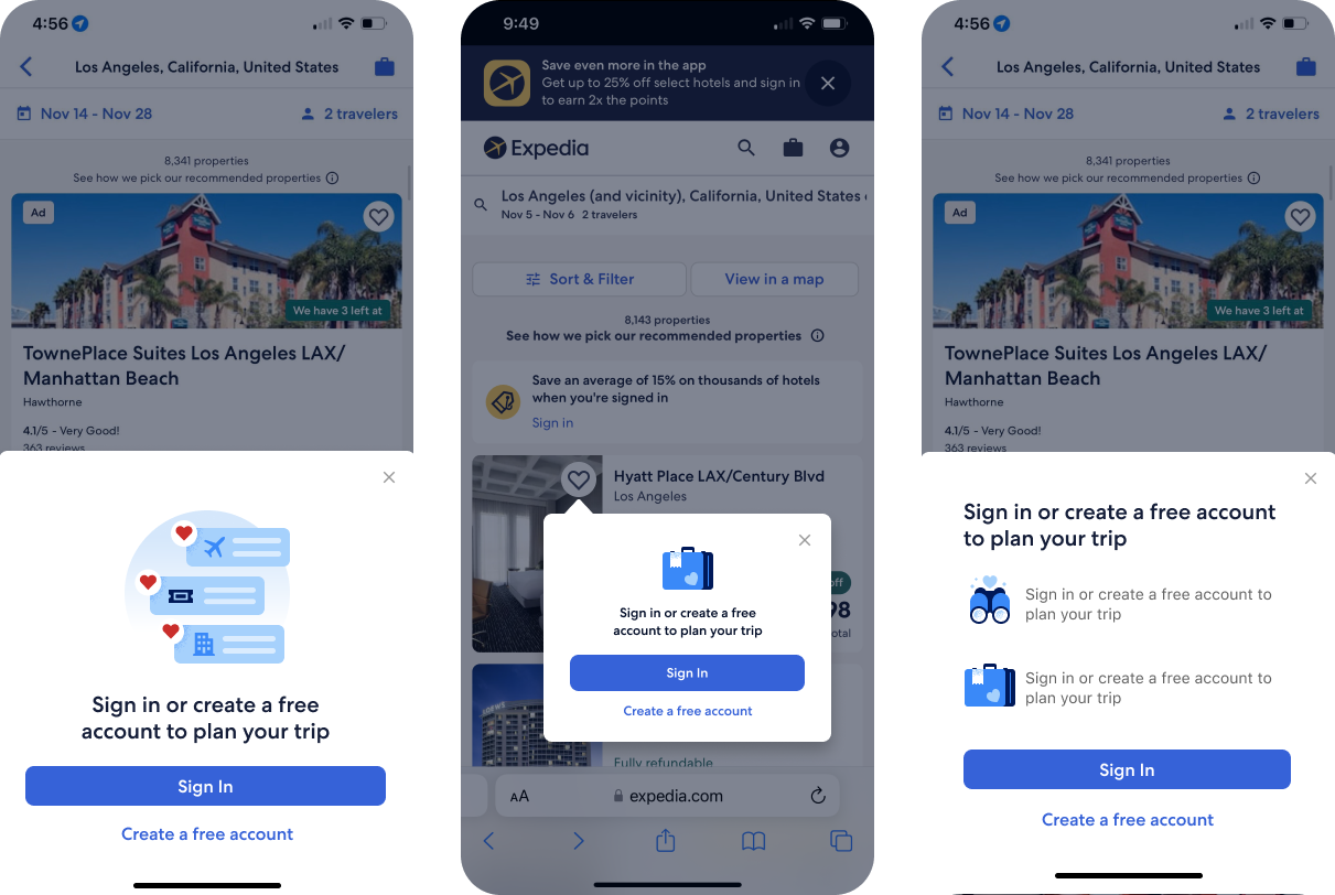
FINAL SOLUTION
I led a solution centered on a half-screen modal that reduced interruption while maintaining context.
The final design:
kept the original screen visible to preserve orientation
introduced benefit-driven messaging to communicate value
used iconography to make the experience more approachable
supported both sign-in and sign-up paths
This reframed sign-in as a lightweight step rather than a blocking moment, helping users stay engaged while understanding why continuing mattered.
DESIGNING SOLUTIONS
Reducing friction within the save flow for authenticated users
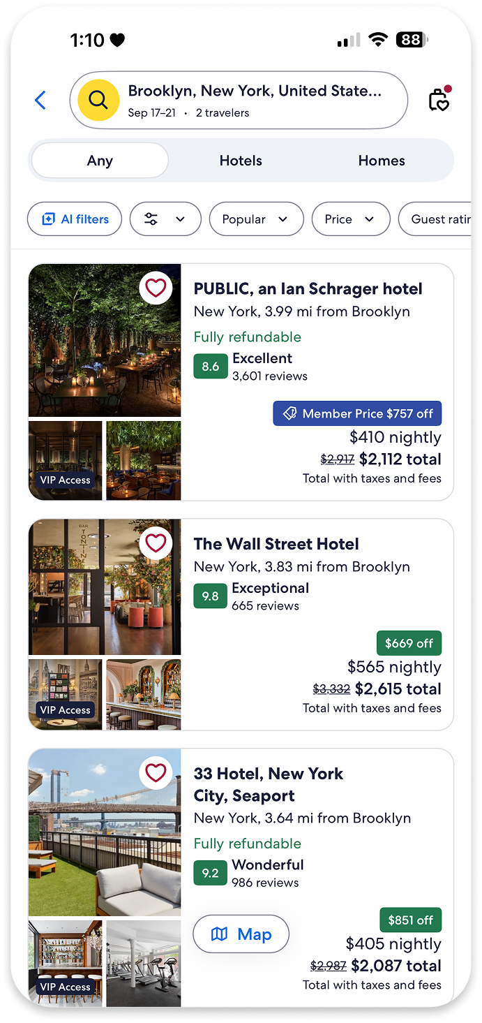
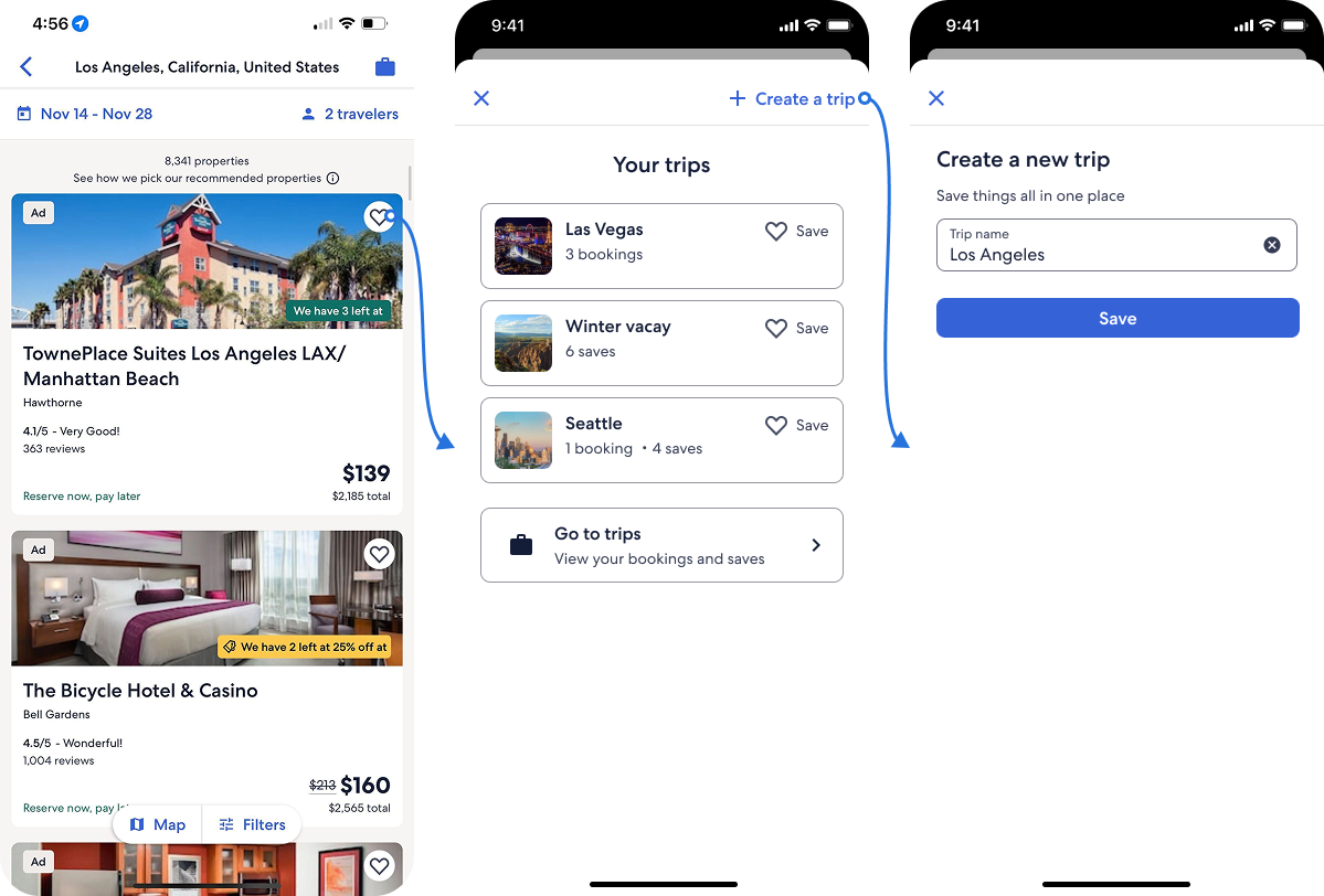
PROBLEM
Even after signing in, users encountered friction within the save flow itself. When selecting or creating a trip, they could lose track of what they were saving, increasing cognitive load and slowing completion.
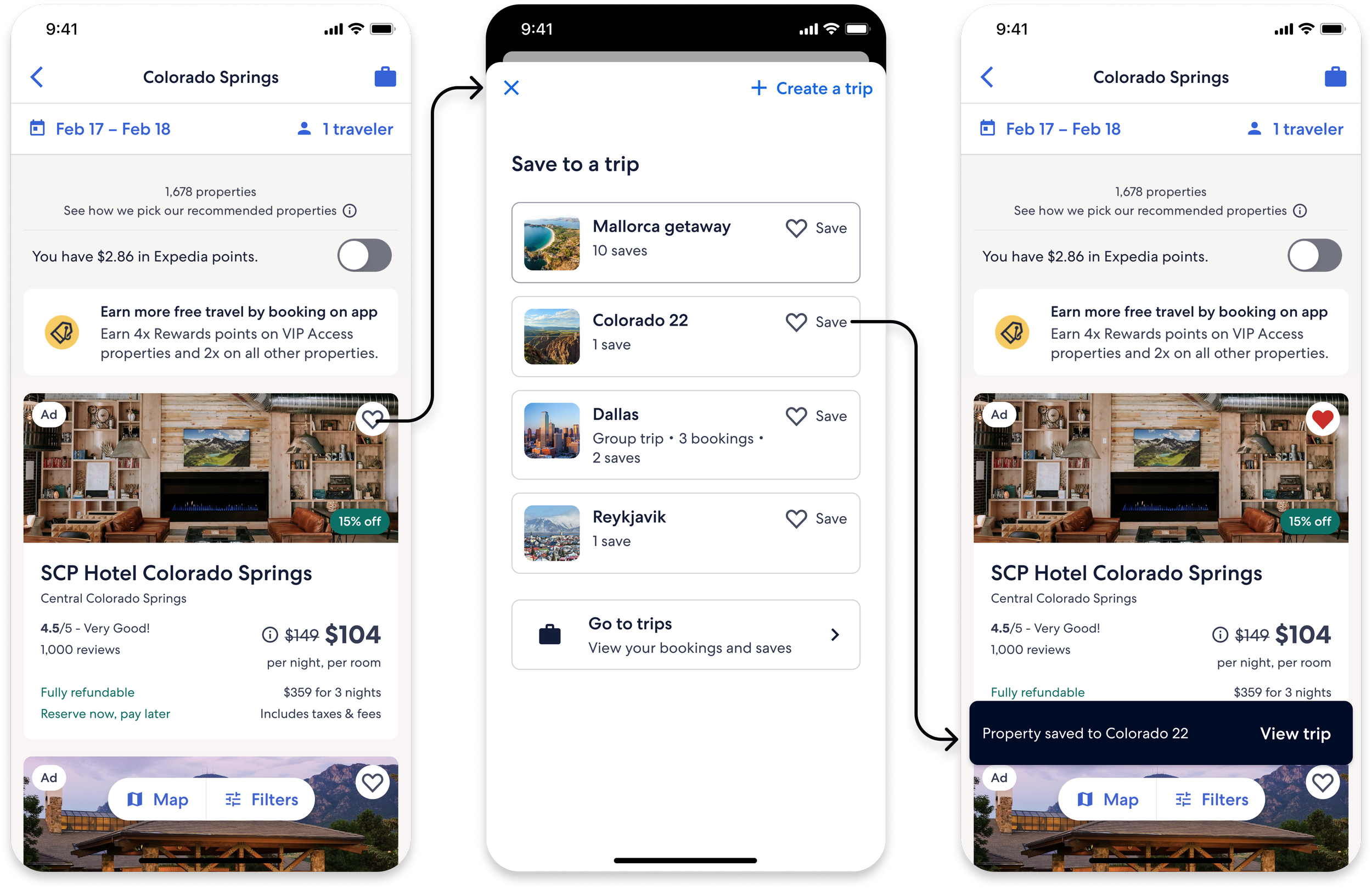
EXPLORATION
We explored multiple ways to maintain context within the existing save drawer, with the constraint of working within the current UI rather than introducing a new screen.
FINAL SOLUTION
I led a solution that introduced trip item recall directly within the drawer.
This included:
a visual reference of the selected item
key details such as name and location
By reinforcing context at the moment of action, this reduced mental effort and helped users move through the flow with more confidence.

DESIGNING SOLUTIONS
Leading optimizations across the saving experience
In addition to the core solutions, I led and collaborated on a series of smaller optimizations that addressed friction at key moments in the flow. While lightweight in execution, these updates helped streamline the experience and support completion.
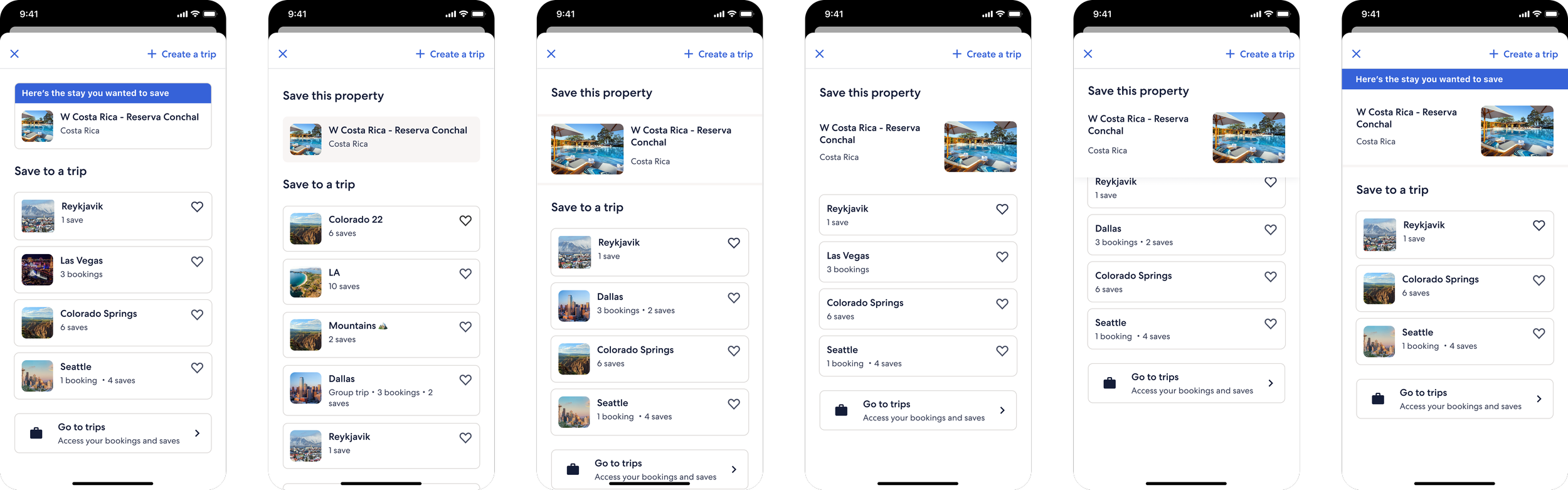
MAINTAINING CONTEXT AFTER SIGN-IN
After signing in, users were often returned to the experience without clear context, forcing them to re-find the item they intended to save. I led a solution that pinned the previously selected item to the top of the search results, allowing users to easily pick up where they left off and continue their action without disruption.
REMOVING THE DESCRIPTION FIELD
The required description field added unnecessary effort during trip creation, slowing users down at a critical moment. Removing it reduced friction and allowed users to complete the save action more quickly, with the option to add details later.
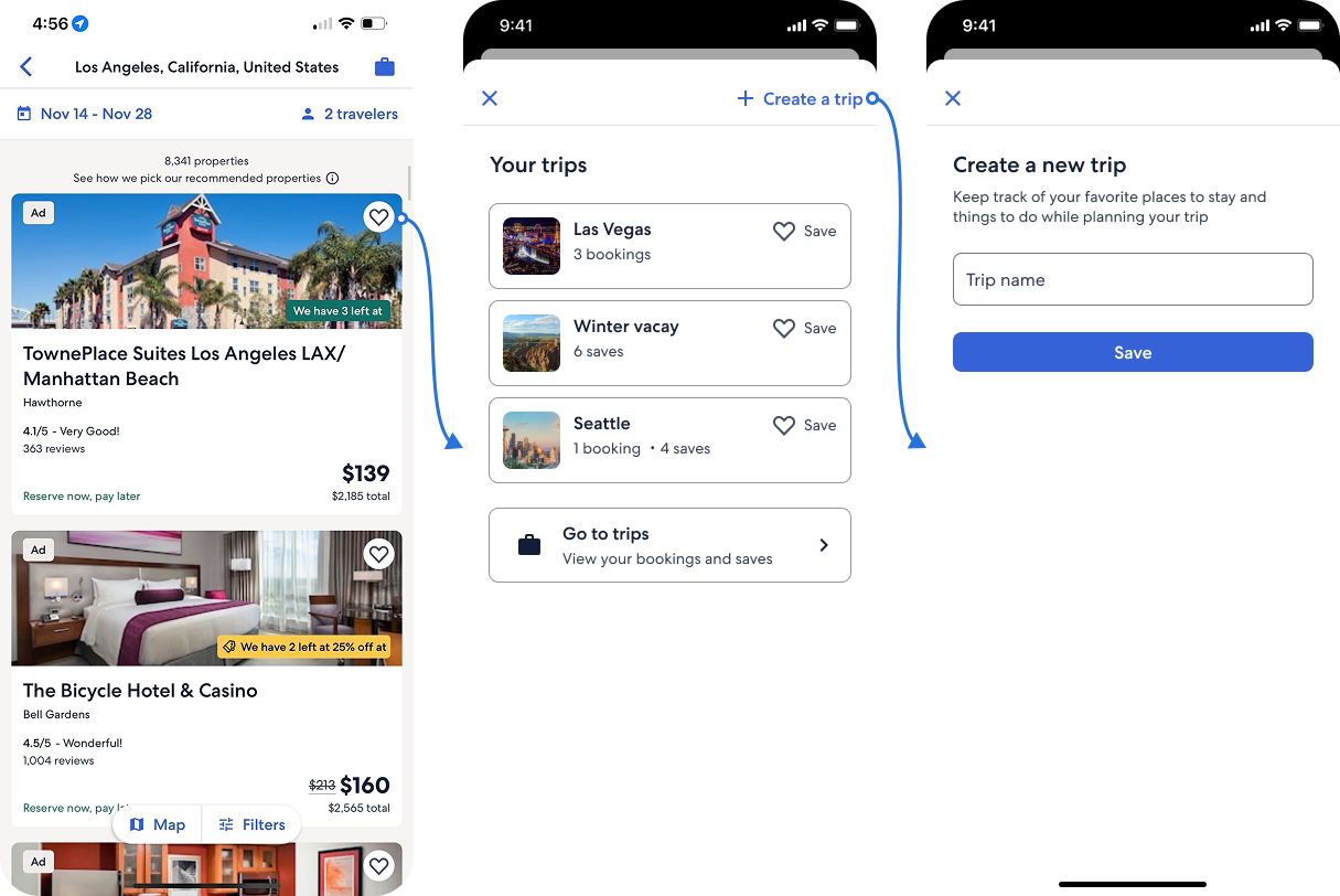
AUTO-NAMING TRIPS
Creating a new trip required users to pause and come up with a name before continuing. I led an auto-naming solution based on location, allowing users to move forward seamlessly while still giving them the flexibility to edit later.
TESTING THE FINAL SOLUTIONS
Turning insights into a system of thoughtful, high-impact solutions
To validate our approach, we ran A/B tests comparing the new experience against the existing control.
Testing duration: 6 weeks
Approach: Tested each optimization individually while also evaluating the broader impact of the combined experience
Focus: Measuring changes in completion rate, engagement, and downstream behaviors
This allowed us to understand both the individual impact of each solution and how they performed together as a system.
FINAL RESULTS
When the pieces came together, user behavior started to shift
Reduced Drop-Off
Post-launch data showed a measurable decrease in users dropping off after initiating the save action. More users were able to move through the flow and complete the action without interruption.
More Trips Created per User
Data showed an increase in the number of trips created per user, signaling that simplifying the creation process made it easier for users to take that next step in their planning.
Increased Funnel Progression
Data indicated that users were more likely to continue exploring after saving an item. This reflected stronger engagement and increased progression further into the shopping funnel.
More Items Saved per Trip
Data also revealed an increase in the number of items saved within each trip. This pointed to improved confidence in the experience and deeper engagement with the Save feature.